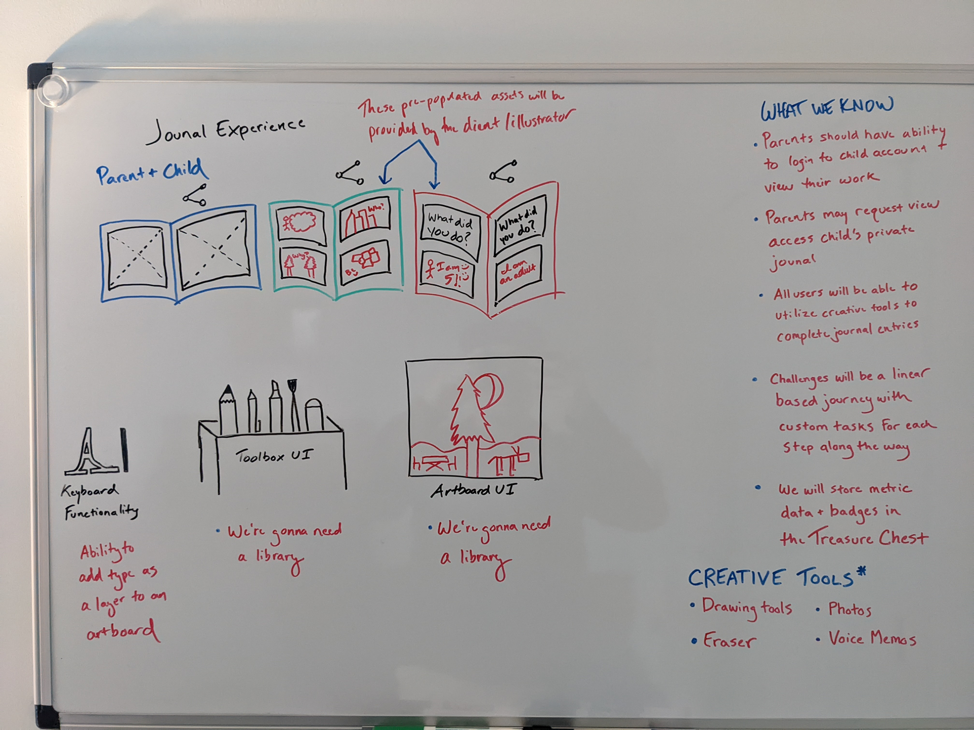
jurna is a mobile app with a focus on children's mental health. The idea from the client was to find a way to encourage children to draw and write down their feelings, both with client-generated artboards and blank canvases. The goal was to create a user experience that incorporates modern creative tools, methods of dealing with mental health and also be a fun, interactive experience for kids.
Login & Dashboard Experiences
The Artboard
The User Experience Process


The challenge in building the (formally untitled) Journaling App was to create a next-level product that utilized modern UX principles to build while keeping the experience fresh and engaging for a much younger user base. We would need to strategically implement interactive tools that kids would be excited to use and also wouldn't break the bank on engineering costs.
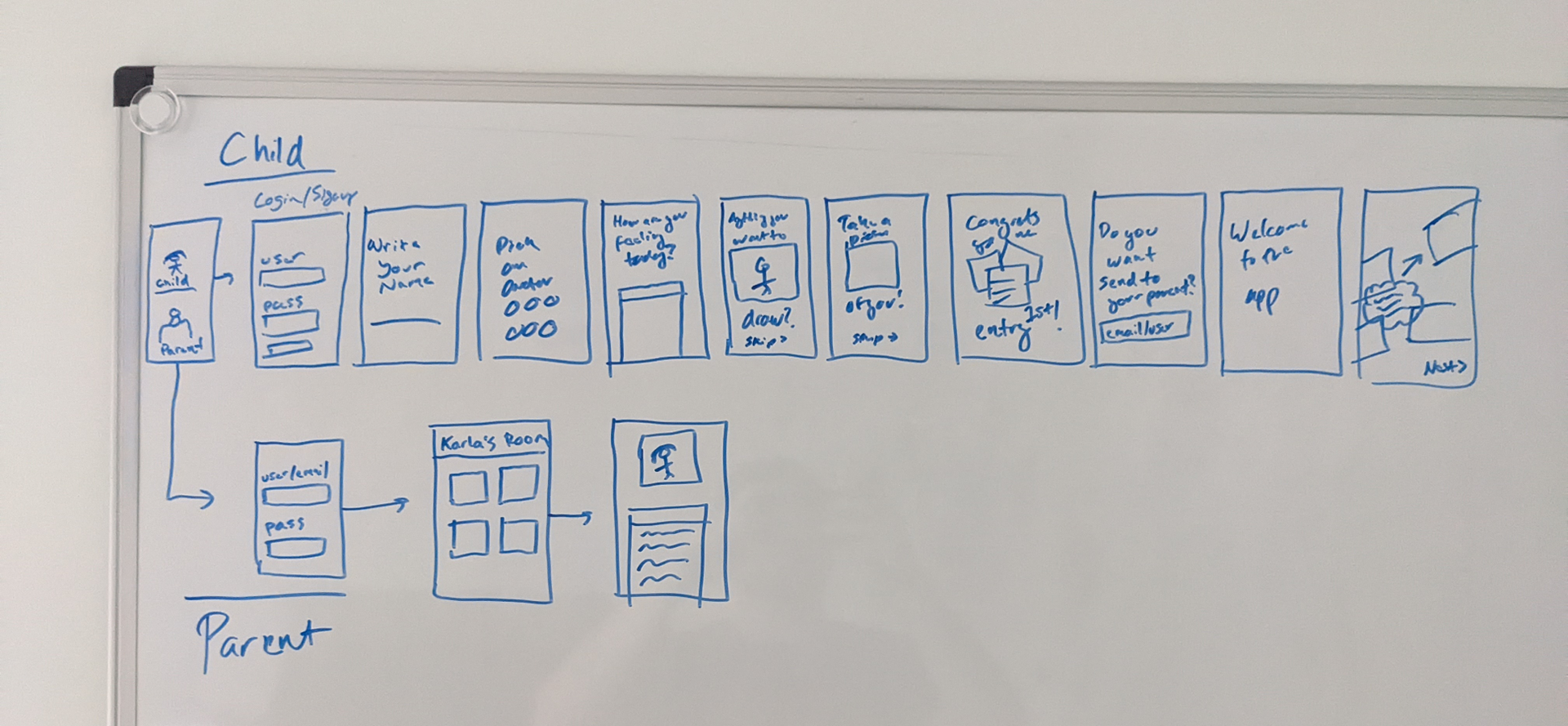
The "Child" experience was designed to guide users through its efficient tutorial flow, which would present the major value win of the app and create their account while not demanding too much of their time and attention. We wanted to excite users and introduce them to the vast journey that would lie ahead in the app.
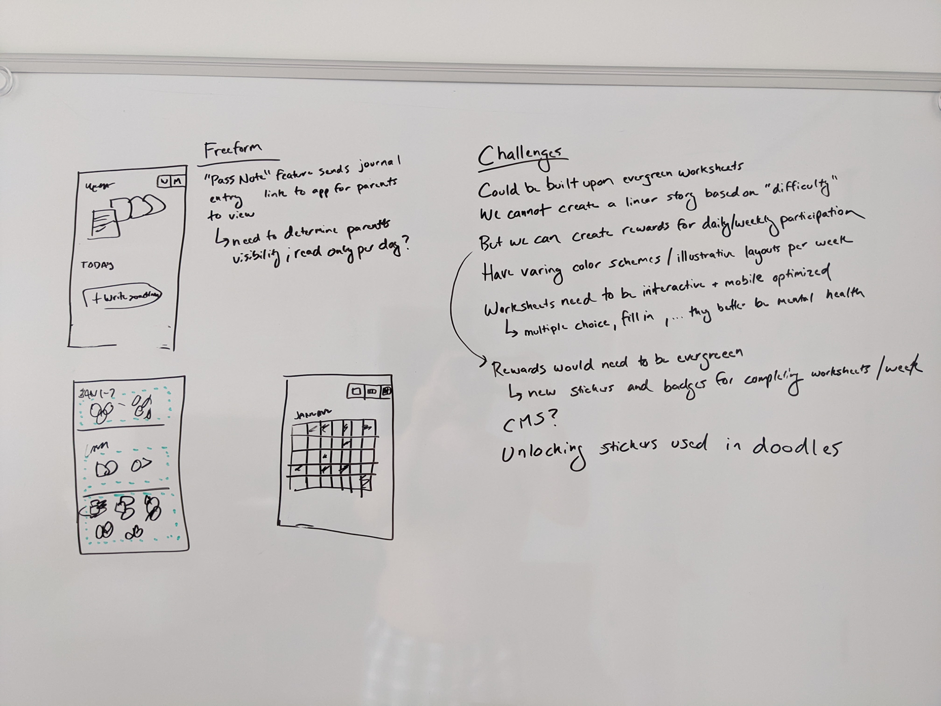
The entire experience would be built around the client's mental health focus illustrations, which would be incorporated into interactive artboards. With the established goal clearly stated, we found ways to leverage it in a variety of experiences, from basic journaling techniques to challenges, and daily check-ins, with stickers and badges as rewards for their gameplay.
Similar to family accounts in streaming services, it was crucial that the Parent users had the ability to manage their family account. Additionally, the parent and child would be able to share their jurna Books with one another, essentially making a collaborative artboard they could both work together on.
Wireframing
And from a lofi prototype and engineering validation...
As an experiment during UX, I took it upon myself to come up with some creative name ideas for the app. jurna, which combines "journal" and "journey" with a fun startup vibe, was my pitch to the client, and it has remained the brand ever since.
The major value win of the app was both leveraging the mental health focuses content that the client has been provided for other projects into an interactive, digital experience, and building a UX around it that would keep users coming back to to use it.
Challenges, which may or may not have borrowed inspiration from an addicitive sweet smashing game, was designed to provide a linear journey for users to take part in. Each "level" would be focused on a specific mental health topic and the progression would dive deeper into each subject.
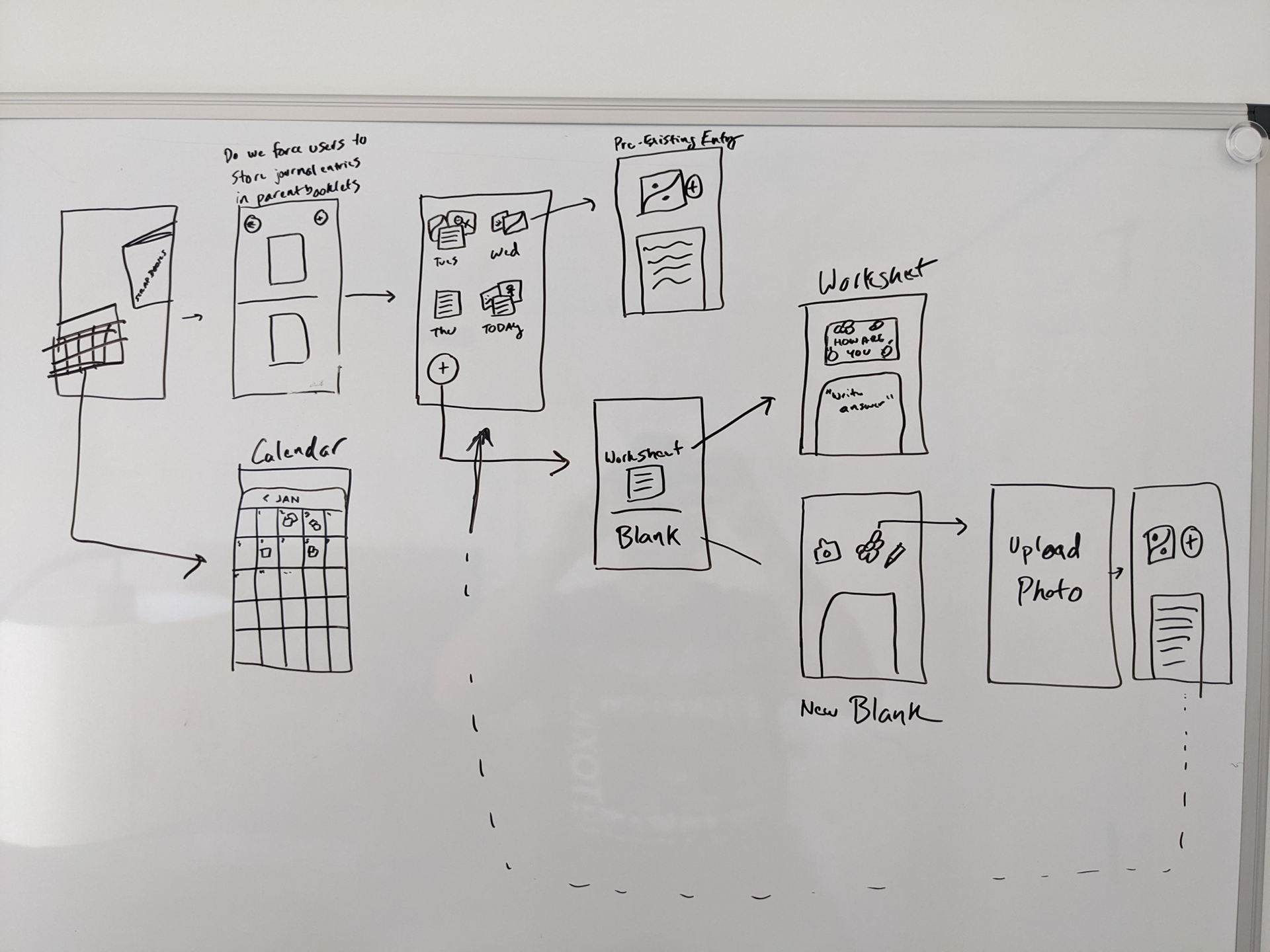
The dashboard experience was key in that it was able to provide a "safe space" that feels welcoming and yet also provided access to all necessary functions. The Library (left) needed to feel personal for users when browsing content and adding new material of their own. The main dashboard (right), the "jurnaroom", needed to feel like home. It provides quick access to all major navigational landmarks of the app but was also subtle, visual, and fun. The idea was to make users feel like it was their room, which they would feel compelled to write more often.